An Infographic is a visual way of content marketing that helps to transform a dull or complicated topic, into an eye-catching, interesting format. Ideally, Infographics should be visually engaging, but still informative, containing a relevant subject and clear statistics. Read more here:
Sometimes people get confused as to the point of an Infographic. An Infographic is not a collaboration of data, but a visual representation of data that people find easier to understand and refer to.
Here are some of the facts to back it up (https://www.impactbnd.com/blog/visual-content-marketing-statistics-2017):
- 53% of marketers stated that 91% to 100% of the content they published in 2016 contained visuals.
- When asked what kind of visuals were most frequently produced 35% of marketers said that they used stock photos the most, followed by 30.4% saying they used original graphics, such as infographics, the most.
- 41.5% of marketers said that infographics had the highest engagement.
- 71.1% of marketers claimed to spend less than five hours a week making visuals.
- 31.7% of those surveyed said that visual content was integral to their 2017 marketing strategy.
- When asked how much marketers projected to spend on visual content in 2017, 35.5% predicted they would spend more than a third of their entire budget on visual content.
Infographics are great to add to your website, Social Media post or even to a data report, to keep it engaging and break it up a little. They show creativeness and initiative.
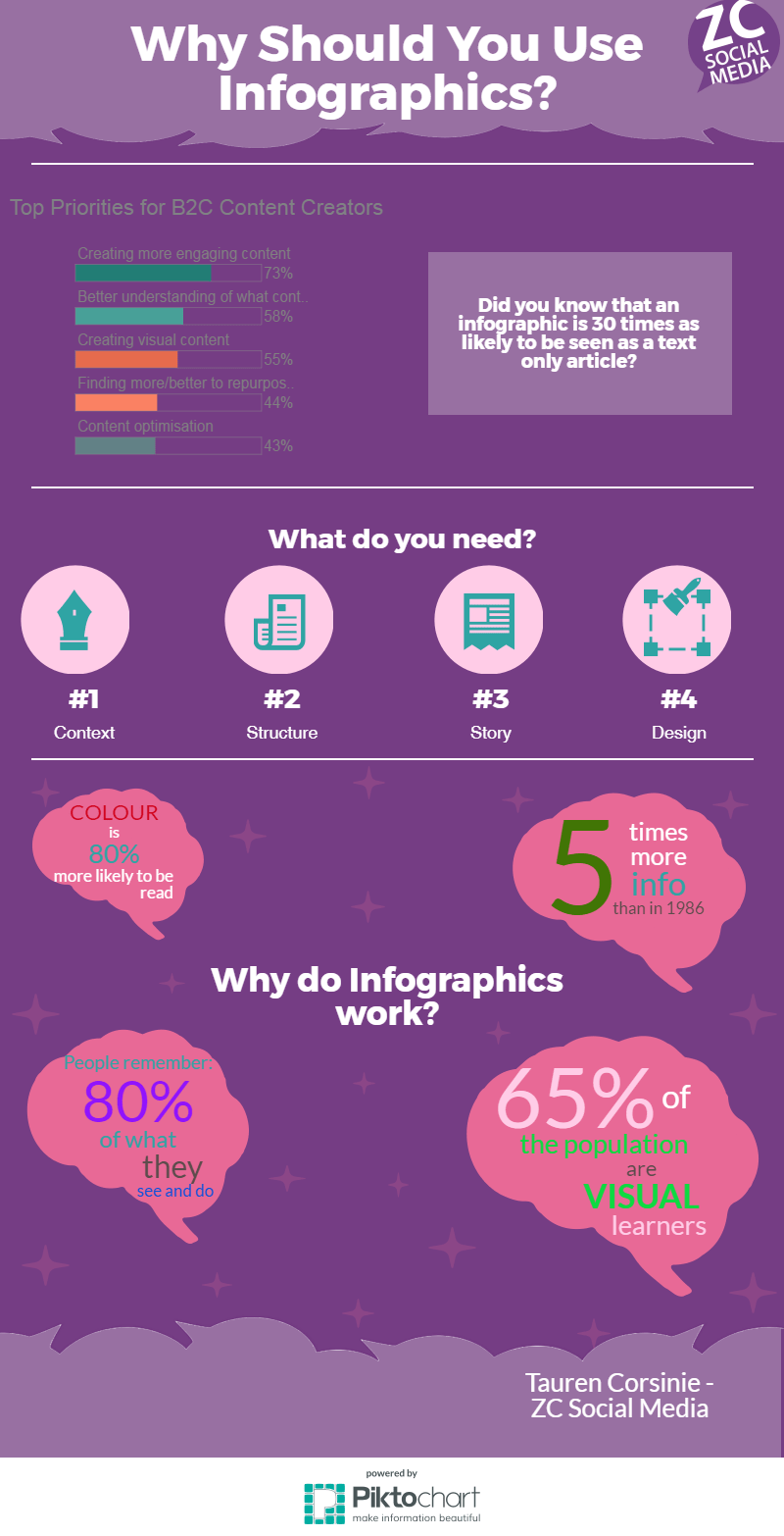
Below is an infographic that I have created on Piktochart (a free platform) to help you visually understand the importance of infographics.